
Mobile-First Layout Strategy for Hong Kong Markets
Discover why starting with mobile design matters and how to structure your CSS for better responsive results across all device sizes.
Two powerful layout tools. Different purposes. Learn which one solves your design problem.

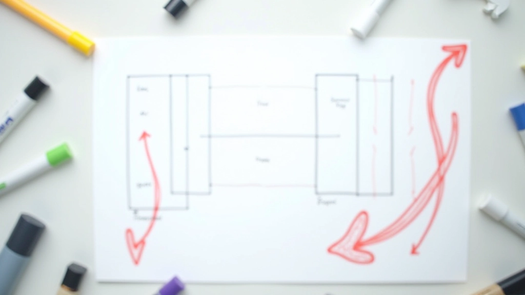
You’ve probably heard both names thrown around — CSS Grid and Flexbox. They’re often mentioned together, as if they’re interchangeable. But here’s the thing: they’re not. Each one solves different layout problems, and knowing when to use each will make your CSS life so much easier.
We’re going to break down exactly what each one does best, show you real examples, and help you stop guessing and start choosing confidently.

Flexbox is fantastic for laying things out in a single direction — either a row or a column. Think navigation bars, buttons in a row, or stacking cards vertically. It’s flexible, responsive, and honestly, you’ll use it constantly.
The real power of Flexbox is distribution. You can tell items to stretch, shrink, wrap, or align themselves in ways that just work. No media queries needed in many cases. You set it and it adapts to whatever space it has.
Grid is your tool when you need to control both rows and columns at the same time. Imagine a magazine layout or a dashboard with multiple content areas that need to align both horizontally and vertically. That’s where Grid excels.
With Grid, you define the entire structure upfront. You create columns and rows, then place items into specific cells. It’s more powerful for complex layouts but also more explicit — you’re telling the browser exactly where everything goes.

This guide presents general best practices for responsive layout design. Actual implementation details vary based on your specific project requirements, browser support needs, and performance considerations. Always test your layouts across target devices and browsers to ensure optimal results.
Let’s be honest — you’ll probably use both on the same project. A typical Hong Kong business website might use Grid for the overall page structure (header spanning full width, sidebar on left, content on right) and Flexbox for components inside those sections (navigation links, button groups, card collections).
The key is recognizing what problem you’re solving. Need to arrange items in one direction? Flexbox. Need two-dimensional control? Grid. Don’t overthink it — pick the tool that matches the layout challenge you’re facing.


Both CSS Grid and Flexbox are essential tools for modern responsive design. They’re not competitors — they’re complementary. You’ll use Flexbox for component-level layouts and Grid for page-level structures. The more projects you build, the more instinctive this choice becomes.
Start learning them both, use them in real projects, and you’ll quickly develop an intuition for which one solves each layout problem. That’s when your CSS becomes cleaner, faster, and way more maintainable.
Have layout questions? Let’s talk